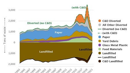
An environmental science class is using the UO’s sustainability dashboard to overcome a common problem with such topics: making a big, global issue like climate change relevant at the local level.
That’s a challenge facing any instructor teaching the Introduction to Environmental Studies sequence, courses required of environmental studies and science majors and minors that also fulfill core education requirements for students in other disciplines. But geography and environmental studies professor Lucas Silva developed an innovative approach to address the question of scale and application in environmental topics.
In winter 2022, Silva taught Environmental Studies 202: Introduction to Environmental Studies in the Natural and Applied sciences. In the course description, Silva emphasizes the need to understand scientific data in order to make reasoned arguments and recommendations on what people should actually do about environmental issues. The goal is to help students develop basic science literacy and the ability to work with various types of data and then apply that data to real world solutions.
To develop the ability to understand data and use it to make specific recommendations, Silva crafted an assignment where students use information from Project Drawdown, a research-driven breakdown of the top solutions to global warming; an academic article focused on the importance of localized carbon reduction strategies; and data from the university’s sustainability dashboard.

The results took the big picture of climate change solutions broadly from Project Drawdown and localized it to what the UO is, could or should do to reduce carbon emissions on campus, including areas of potential competition and recommendations for future improvements.
“Students responded with enthusiasm,” Silva said. “They were eager to look under the hood of the very impressive, dynamic infographics that populate the UO's Office of Sustainability website, with design credit to the InfoGraphics Lab, and they were excited to develop their own data charts and feedback loop equations, which they learned in class, to identify synergies between local action taking place on campus with the broader set of activities and policies for climate change mitigation and adaptation led by the global community.”
In course evaluations, one student said course content “was often focused on environmental issues in (the) modern day and discussing real-life solutions to these issues and why these solutions are (or) are not actually helpful (or) productive,” and another said the course “is extremely relevant to today’s climate issues and allowed for an easier understanding of the concepts.”
Faculty members and students are invited to explore the interactive visualizations on the sustainability dashboard and to download and use the data in coursework and research. The site data is managed by the Office of Sustainability with visualizations designed by the InfoGraphics Lab.
—By Sarah Stoeckl, Office of Sustainability


