
Revising existing infographics could make it easier for families to know what to do during wildfire season, UO study suggests
Air pollution infographics currently used by U.S. government agencies may not adequately protect children from the health risks posed by wildfire smoke, researchers from the University of Oregon School of Journalism and Communication find.
“Current air quality communications directed to the general public tend to reflect the risk posed to the average adult, but the smoke levels we’d constitute as unhealthy for children are looking to be lower than initially thought,” said Catherine Slavik, an environmental health and communications researcher in the school’s Center for Science Communication Research. “Exposure to even low or moderate levels of smoke can affect children’s health, but parents aren’t always aware that their kids might be more at risk than the average adult."
By designing various air quality index visuals to signal the dangers of moderate air pollution exposure for kids, Slavik and her colleagues found that certain infographics were better at motivating parents to take protective measures for their families during wildfire smoke events. The visuals contrast air quality infographics used by U.S. agencies today, suggesting that there may be more effective ways to communicate risks concerning vulnerable populations.
The researchers describe their findings in a new paper published July 1 in the journal Environmental Research Communications.
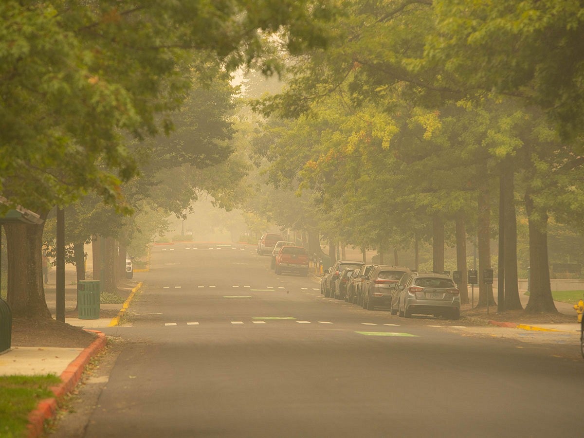
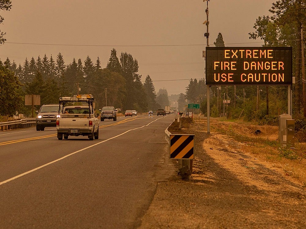
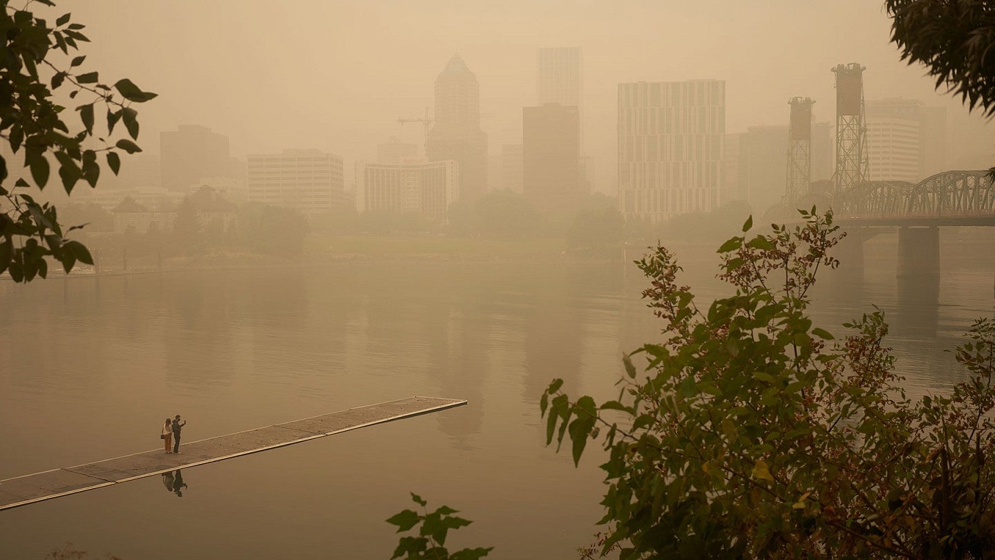
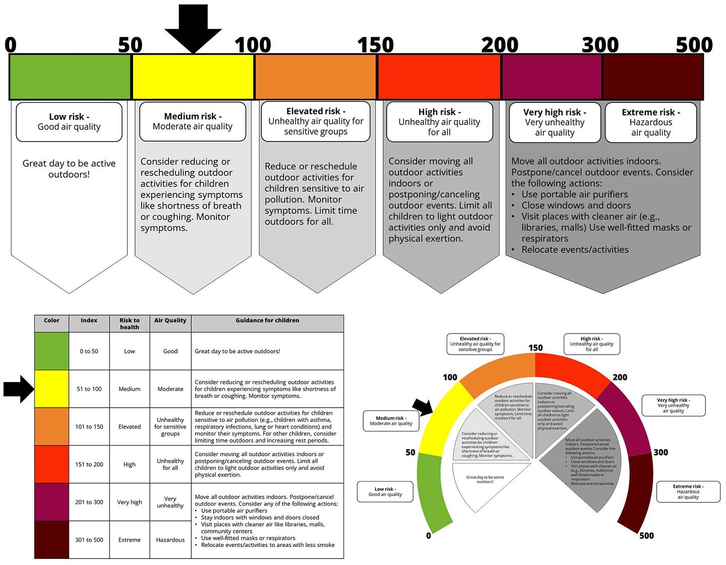
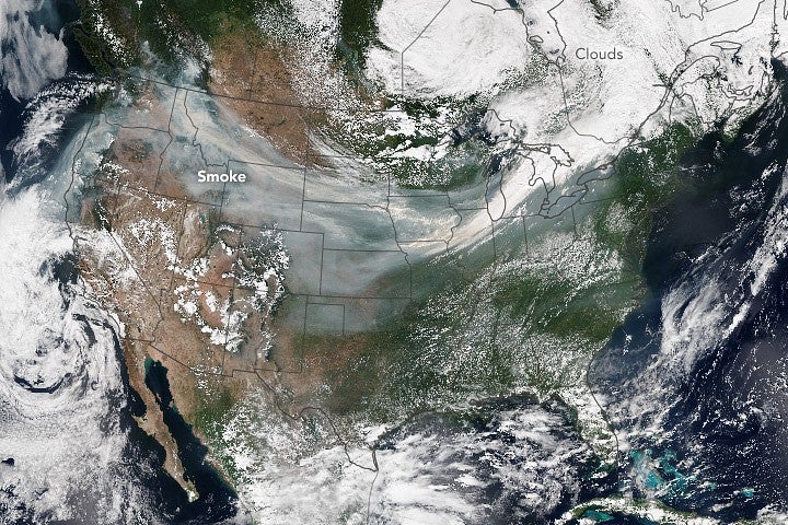
Government agencies in the U.S. rely on the air quality index to communicate how polluted the air is at a given location. That public health tool becomes critical during wildfire season as air pollutants from smoke can drive up AQI values and prompt agencies to issue alerts about how to reduce exposures.
Commonly displayed as a numeric scale with color-coded descriptors ranging from good to hazardous, the AQI can be sometimes difficult to interpret, especially at moderate levels, Slavik said. She describes that range as a “vague, ambiguous zone of risk” that can be particularly obscure to parents trying to figure out how to respond.
"The motivation for this paper came from a conversation I had with my co-author Michael Coughlan from the UO’s Center for Wildfire Smoke Research and Practice, who has school-aged kids,” Slavik said. “He spoke about the confusing decision-making process parents and schools often go through when responding to varying levels of wildfire smoke in the air. If he, a wildfire-risk researcher, was unsure how best to respond, surely other parents are also confused.”
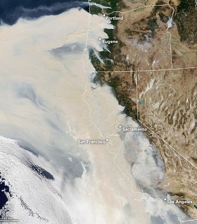
Slavik and her team set out to evaluate effective ways of informing parents of wildfire smoke risks and actions that help reduce children’s exposure. Using popular modes of communication like the air quality index, the researchers designed a dozen infographics based on existing visuals from agencies like AirNow and Environment and Climate Change Canada. They presented them to parents living along the West Coast of North America, including the states of California, Oregon and Washington and the province of British Columbia.
Among the 12 graphics, the air quality information was presented in either a table, a line chart or a gauge chart with a dial shape. The air quality values also were presented with either the American AQI scale, ranging from zero to 500+, or the Canadian AQHI scale, ranging from one to 11+. That tested whether parents interpreted the two scales differently.
Parents also were asked to imagine themselves in one of two hypothetical scenarios: when smoke reached either moderate or high levels. Some parents were shown a graphic that indicated a moderate-risk air quality level with an arrow pointing just shy of the middle of the range; others saw a high-risk one with an arrow pointing toward the elevated end.
After randomly assigning an infographic to each parent, the researchers asked them to imagine encountering it on a school day during a wildfire event. The parents then answered questions indicating how concerned they were, how likely they were to engage in smoke-safe behaviors like canceling or rescheduling outdoor activities or using a portable air purifier, and how supportive they were of policies aimed at reducing wildfire smoke exposures.
Parents were then asked to imagine a long-term scenario where they encountered the same infographic daily for a full school week. They again reported their worry, action intentions and policy support.
The researchers found that, in most cases, parents who saw a high-risk level, regardless of how the infographic was designed, were more likely to be worried and take action than parents who saw a moderate-risk level. The result was no surprise to the researchers.
But there were times when the moderate-risk group was almost as worried and ready to act as the high-risk group, such as when the Canadian AQHI scale of one through 11+ was presented as a line or dial during the short-term scenario. The American AQI scale of zero to 500+ didn’t prompt the same response.
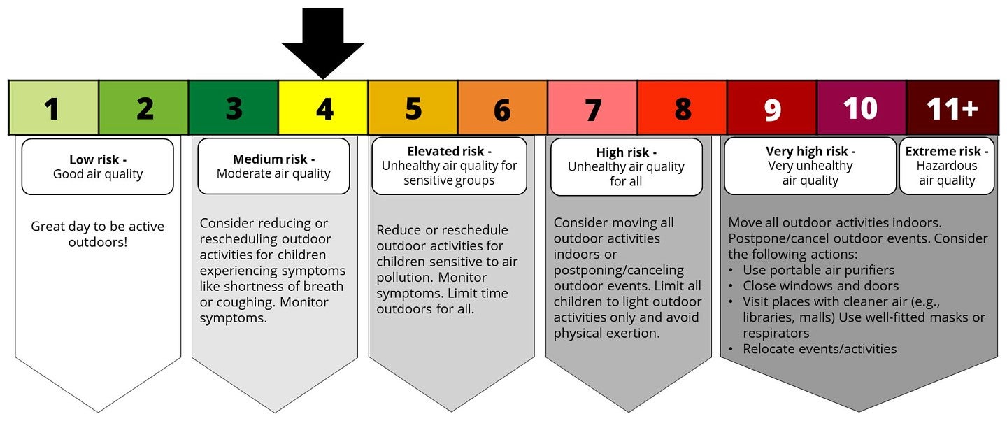
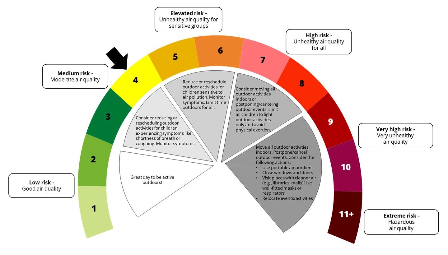
Infographics using the AQHI scale in a line or gauge chart may help parents be more attuned to the dangers of moderate air quality in short-exposure situations (Courtesy of Catherine Slavik)
According to Ellen Peters, director of UO’s Center for Science Communication Research and a professor of journalism, communication and psychology, the smaller numerical scale of the AQHI may be easier to process than the AQI. As a researcher on numerical literacy, she explained that people can perceive the differences in magnitudes of smaller numbers, like one versus five, better than larger numbers, like 1,001 versus 1,005. The AQHI may sometimes better communicate the “bigness of risk,” Peters said.
Although the study might show some advantages of using the AQHI, more studies need to be done before American government agencies and communicators consider transitioning to air quality indices that use smaller values, Peters said.
"We know enough to want to find out more. The need to test is much more real now that we have this additional season in the Pacific Northwest."
Slavik and her colleagues are planning another research project to look deeper into the jurisdictional differences of how parents in Oregon, Washington, California and British Columbia experience issues around wildfire smoke. They also are planning to launch a similar experiment with parents living on the East Coast.
“Some of these projects are really important on the East Coast because they may also have a smoke season in the future,” Peters said. “It's not going to be from wildfire right around them but wildfire smoke drifting over from the West Coast and Canada."
Since joining the UO in 2022, Slavik has collaborated with Peters to investigate the adequacy of current public health messaging on wildfire events. Earlier this year, they found that government warnings on wildfire smoke are often issued too late and need to be more proactive. But when the air is already choked with smoke, their latest research reveals how air quality index communications can be improved to reach parents and protect vulnerable populations, including children.
All these gaps couldn’t have been bridged without the wisdom and curiosity of their interdisciplinary research group.
“You really need an all-hands-on-deck approach for this kind of work,” Slavik said. “Had we not had folks with expertise in psychology, communications, public health and ecological resilience come and study this problem together, we maybe wouldn't have created a project as wide-reaching.”
This research was funded by the National Institute of Environmental Health Sciences, National Institutes of Health and supported in part by the Banting Postdoctoral Fellowships program of Canada and the U.S. National Science Foundation.