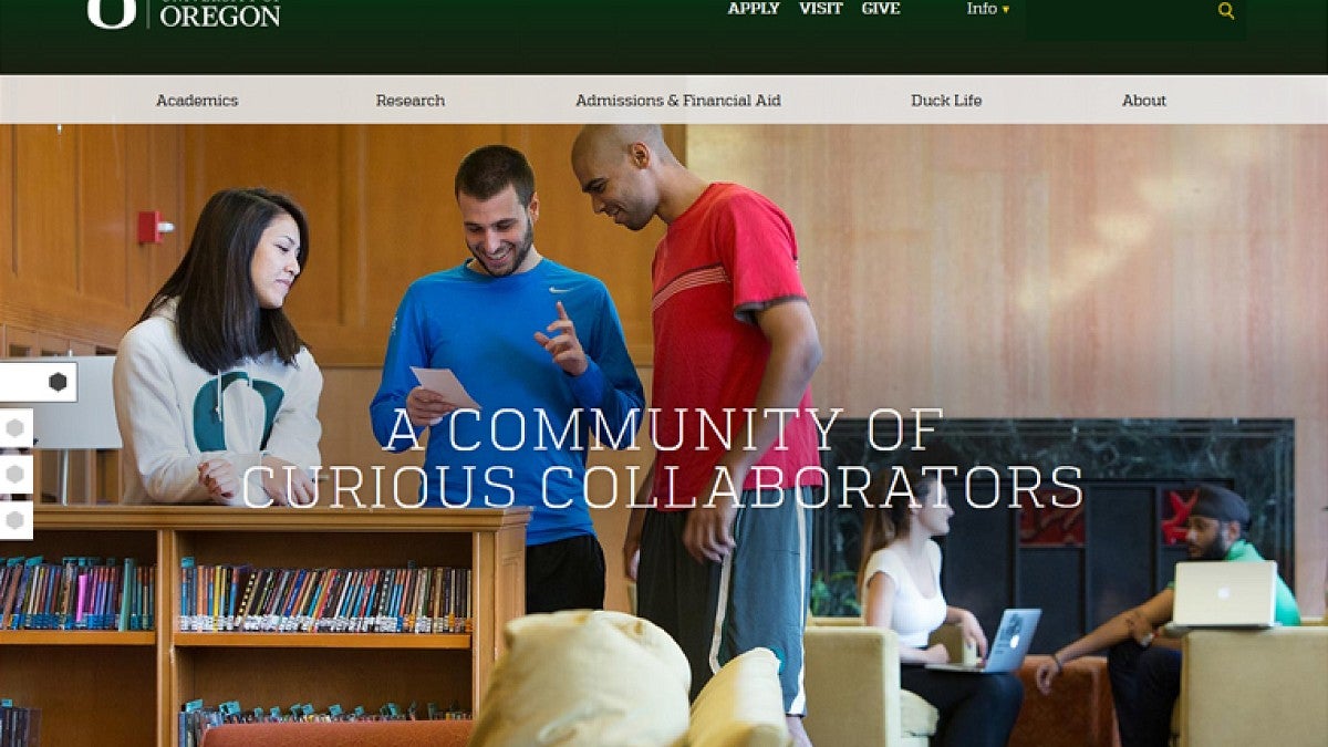
As students, faculty and staff return for the winter term, they will find a new University of Oregon homepage. The uoregon.edu domain has been redesigned as part of the overall branding communication initiative, with the goal of raising awareness of the UO, highlighting its academic and research endeavors.
“Nationally, university homepages are evolving to be the face of the organization to external audiences,” said Tobin Klinger, senior director of public affairs communications. “A primary function is to help prospective students, and families, by getting them get the information they need to apply and enroll.”
While the look and feel of the page has been updated and refreshed, internal audiences can find many of the resources they use through accessing the new “Info” landing pages, conveniently located on the top navigation bar of the new homepage. In addition, links to commonly accessed resources are located in the footer of the homepage.

With the growth of mobile devices – which now surpass desktop computers for Internet use – the new UO homepage was designed, and optimized, for mobile. The prior homepage was not designed for mobile devices.
“We need to think strategically about how we are presenting ourselves to our many audiences in ways that grow their affinity for UO,” said Tim Clevenger, associate vice president for communications, marketing and brand management. "Our website is a key tool used to recruit more talented students, faculty and staff and help our donors find ways to give to the UO. In fact, within two days of the university launching its new television commercial, the UO website had over 90,000 page views by audiences outside the UO. To better communicate with many audiences, we will use our new website in new and interesting ways, exploring different ways of storytelling and incorporating interesting links.”
Current students, faculty and staff who are interested in an internally-focused website with information tools that are specific to daily life at UO are encouraged to visit AroundtheO at around.uoregon.edu. In addition, visit the “Info” landing pages for current students and faculty and staff and bookmark them to avoid the need to go to the homepage for internal information and resources.

More information about the new design for the UO homepage is available in the following Q&A.
Why did the university change the website?
After months of talking to faculty, staff, students and alumni exploring the core of what the university represents, the UO is launching a new four-year communications initiative to raise the external awareness of the university and to share with the world just how good the UO’s academic and research endeavors really are. The new university website is part of this integrated campaign, showcasing the UO as an academic powerhouse and emphasizing how the university was founded on a commitment to a tradition of classic liberal arts education. The communications initiative, which combines traditional marketing communications techniques and tools with guerilla tactics, is funded entirely through a private gift.
Why is the new website primarily focused on prospective students and their parents?
The communications initiative supports goals of recruiting students and top-tier faculty, as well as the university’s $2 billion fundraising campaign. And the UO’s website is one of the main tools used to recruit the best and brightest students, faculty and staff. To better communicate with many audiences, we will use the website in new and interesting ways, experimenting with different ways of storytelling and incorporating interesting links.
Where are links to the information I use the most?
The information most faculty, staff and current students look for on a university website includes a list of faculty phone numbers and emails, the campus address, the application form, the academic calendar, contact information for campus police, a course listing, parking information and usable maps. Links to that information now appears in the footer at the bottom of the page on the UO’s new website. It contains links to Find People (contact information for faculty, staff and students) and the A-Z Index (information on university units and departments with their social media links), Blackboard, Duckweb, Webmail, Contact Us (including links for emergency contacts for campus and local police), the academic calendar, the class schedule, campus maps (including a parking map) and directions to campus. This information is also now consolidated on convenient landing pages for each specific audience which are easily found at the very top of the website in the “Info” drop-down menu.
Where can I find the links that are important to me as a faculty or staff member, current student, alumnus/alumna, etc.?
The “Info” drop-down menu at the top of the new website takes visitors to pages specifically tailored to the needs of current students, parents, faculty and staff, and alumni. Analytics for the most-used links on previous versions of those pages informed decision making for which links to include on the new site's audience-based pages. If there is additional links or information you would like on those pages, please let us know.
How were decisions made about what links should be included and what links would be excluded?
Website analytics helped determine which links were most frequently used on the previous site. That analytics information was used to tailor a list of links for each specific audience. The lists were limited to the most sought-after information. Previous versions of these pages on the old website had considerably more links, many of which weren’t included in the new version of the website because they hindered overall usability.
How can I make the new website function for my specific needs?
For faculty, staff and current students who are not interested in navigating through the website to find information specific to their needs, they can choose to bookmark or favorite their specific “Info” pages to locate the most used links for that audience. Instructions on how to bookmark or favorite a page can be found here for Google Chrome, Safari, Firefox, and Internet Explorer.
—By Public Affairs Communications


